Source Selection
We selected our dataset from the official UNESCO Data Hub to ensure validity, consistency, and access to the most up-to-date information. The dataset is maintained and updated annually directly by UNESCO. Our dataset contains key variables such as site name, geographic location, country, year of inscription, selection criteria, category of heritage (cultural, natural, or mixed), and descriptive information about each site. These variables allowed us to examine both the spatial distribution of World Heritage Sites and the historical pace of inscription over time.
Before interpreting the data, we considered the potential silences associated within it. Although the UNESCO Data Hub is an official source, it still reflects the priorities, frameworks, and institutional power of the World Heritage system itself. The dataset records which places have been formally recognized, but it does not capture the many culturally or environmentally significant sites that remain uninscribed, which is a part of what we aim to investigate. We have to acknowledge that the data is not a neutral inventory of global heritage, but a list shaped by nomination processes, state capacity, committee decisions, and global politics.
We approached the dataset with an awareness that heritage recognition is deeply tied to power, visibility, and exclusion. By using the official UNESCO dataset while also critically examining its limitations, we studied what these inscription patterns suggest about broader inequalities in global heritage governance.
Data Processing
The UNESCO World Heritage dataset we used was already relatively clean because it came from UNESCO’s official DataHub, so it required very little data cleaning. However, we still made a few adjustments to make the dataset easier to work with for visualization purposes. In particular, we split the coordinates field into separate longitude and latitude columns so that Tableau could plot site locations correctly in our map visualizations. We also created a decades column to group inscription years into broader time periods, which made it easier to build visualizations showing changes in World Heritage site inscription over time. In addition, to make our data more interpretable in Tableau, ArcGIS, and Python libraries, we had to change the datatypes of certain features from the native datatypes on the Dataset (ex. Integer -> Date).
For most of our visualizations, we relied on Tableau because it allowed us to create polished and professional-looking graphs without extensive coding. This was especially useful for comparing regional patterns, site distributions, and inscription trends in a way that was both clear and visually engaging. In addition, we used Timeline.js to create a timeline of UNESCO World Heritage Committee’s history, including their founding, major structural changes and patterns over time.

Presentation
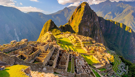
For the presentation of our narrative, we chose a black-and-white theme to create a clean, modern look while also avoiding a visual style that might imply bias in how the data was framed. We built the website in WordPress, which made the editing process more flexible and accessible for our team.. To keep the site visually engaging and globally representative, we incorporated a wide range of photographs showcasing World Heritage sites from different regions, helping readers connect the data to real places and cultures. We also used colorful data visualizations to highlight different layers of information, such as site count, site type, and patterns across regions and time, so that the findings would be both clear and visually compelling. Finally, we included interactive maps to encourage user engagement, allowing visitors to explore the material more actively and view additional details about sites across the world.